
Design Choices We’re Leaving Behind — and What We’re Embracing in 2026
A Thoughtful Look at What We’re Moving Past in 2025 and Where We’re Heading in 2026.
At the start of each year, the design world releases its forecasts—new colors, new materials, new “must-haves.” At Thoma-Holec Design, we’ve always believed that while trends come and go, truly successful senior living environments are shaped by something more lasting.
Rather than focusing on what’s new for the sake of new, we’re reflecting on what continues to work—and what no longer serves residents, families, or operators as well as it once did. What feels timeless. What feels human, and what makes a space feel like home rather than a moment in time.
With that in mind, we’re beginning 2026 by thoughtfully stepping away from a few design approaches that have run their course and embracing others that better reflect how senior living communities want to feel today.
Design Approaches We’re Leaving Behind
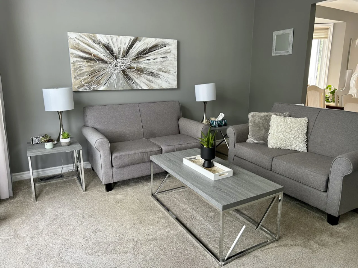
Moving Beyond All-Gray Interiors
Over the past several years, gray became a default solution in many interiors—valued for its neutrality and perceived longevity. While gray can be appropriate in certain contexts, overly gray environments often lack the warmth and depth that residents respond to emotionally. In senior living, spaces should feel comforting, layered, and engaging, not unfinished or overly restrained. As we look ahead, we’re ready to move beyond gray-dominated palettes in favor of richer, more expressive interiors.
When Hospitality Feels Too Commercial
Hospitality design has brought valuable inspiration to senior living, but when interiors lean too far into commercial aesthetics, spaces can begin to feel impersonal. Senior living communities are not lobbies or destinations, they are homes. Design should support daily routines, encourage connection, and foster belonging. When finishes are overly polished or decor feels generic, that sense of home can be lost.
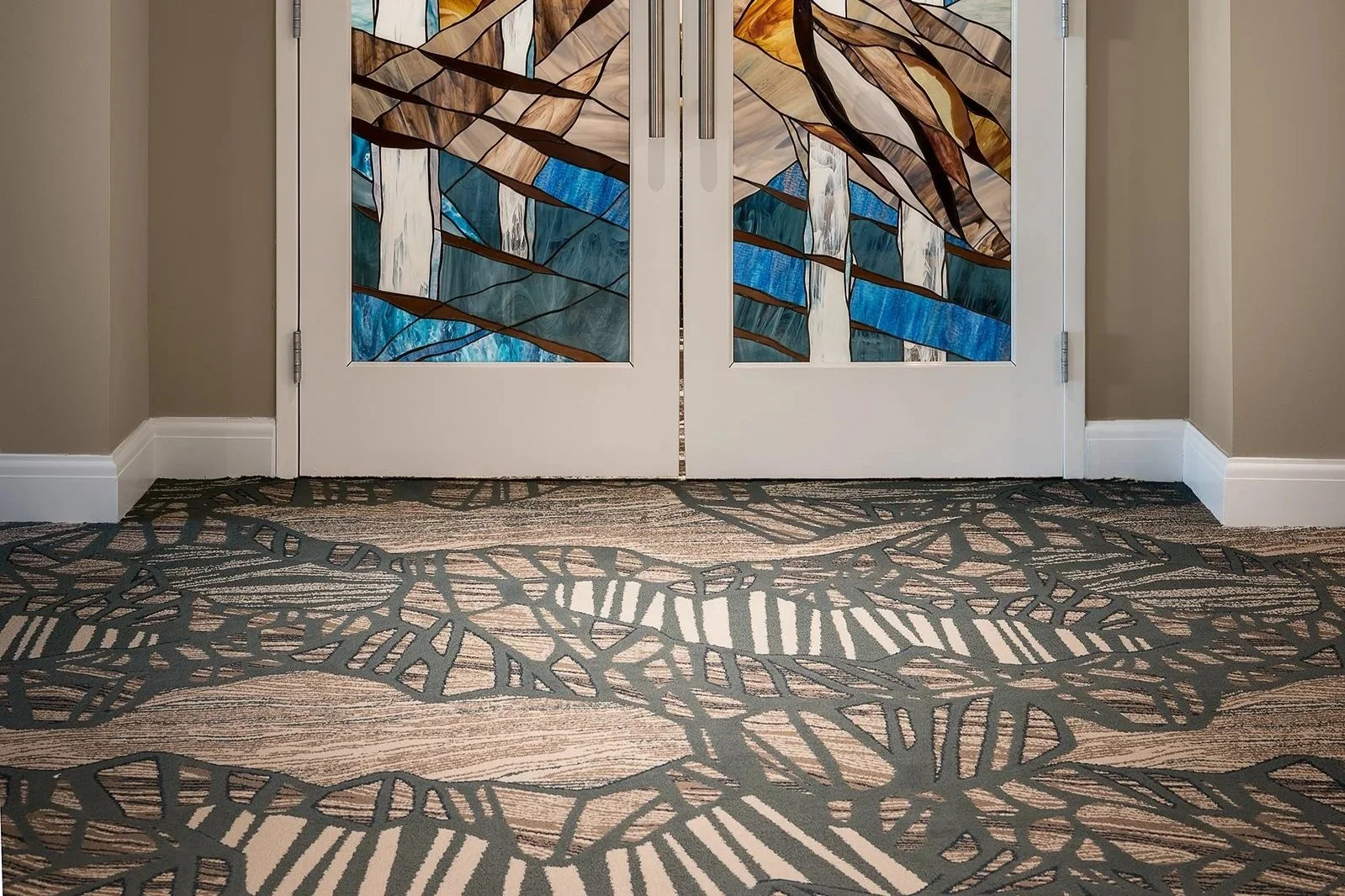
Rethinking Overly Busy Patterned Flooring
Pattern has its place, but flooring should support a space rather than compete with it. Excessive movement and visual complexity can be overwhelming, particularly for aging eyes. In 2026, we’re prioritizing flooring that grounds a room, enhances clarity, and allows furnishings, art, and architecture to take the lead.
Neutral Doesn’t Have to Mean Forgettable
Neutral palettes will always have a role in senior living, but environments built entirely around beige-on-beige risk feeling flat and indistinct. Calm can coexist with contrast. We’re moving toward spaces that feel serene yet memorable—where subtle variation and intentional color bring personality without sacrificing comfort.
Design Directions We’re Embracing in 2026
A Return to Richer Wood Tones
Deeper wood finishes—warm walnuts, darker stains, and expressive grains—are making a meaningful return. These materials bring warmth, depth, and residential familiarity, pairing beautifully with layered textiles, art, and lighting to create spaces that feel grounded and timeless.el.
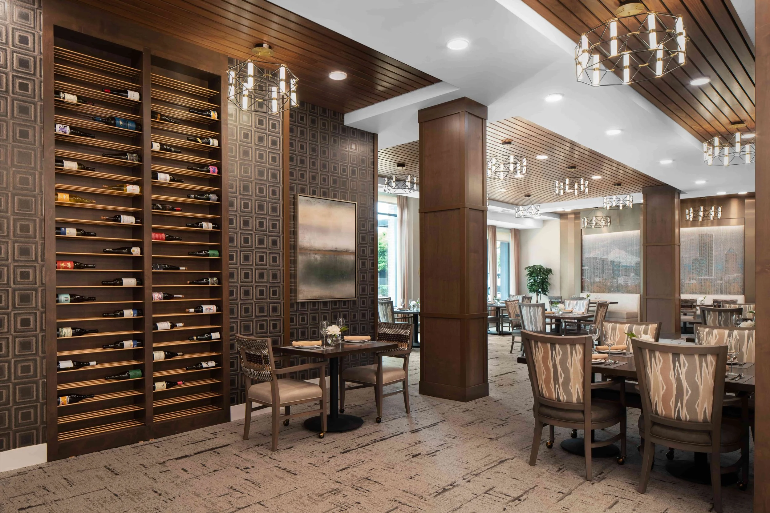
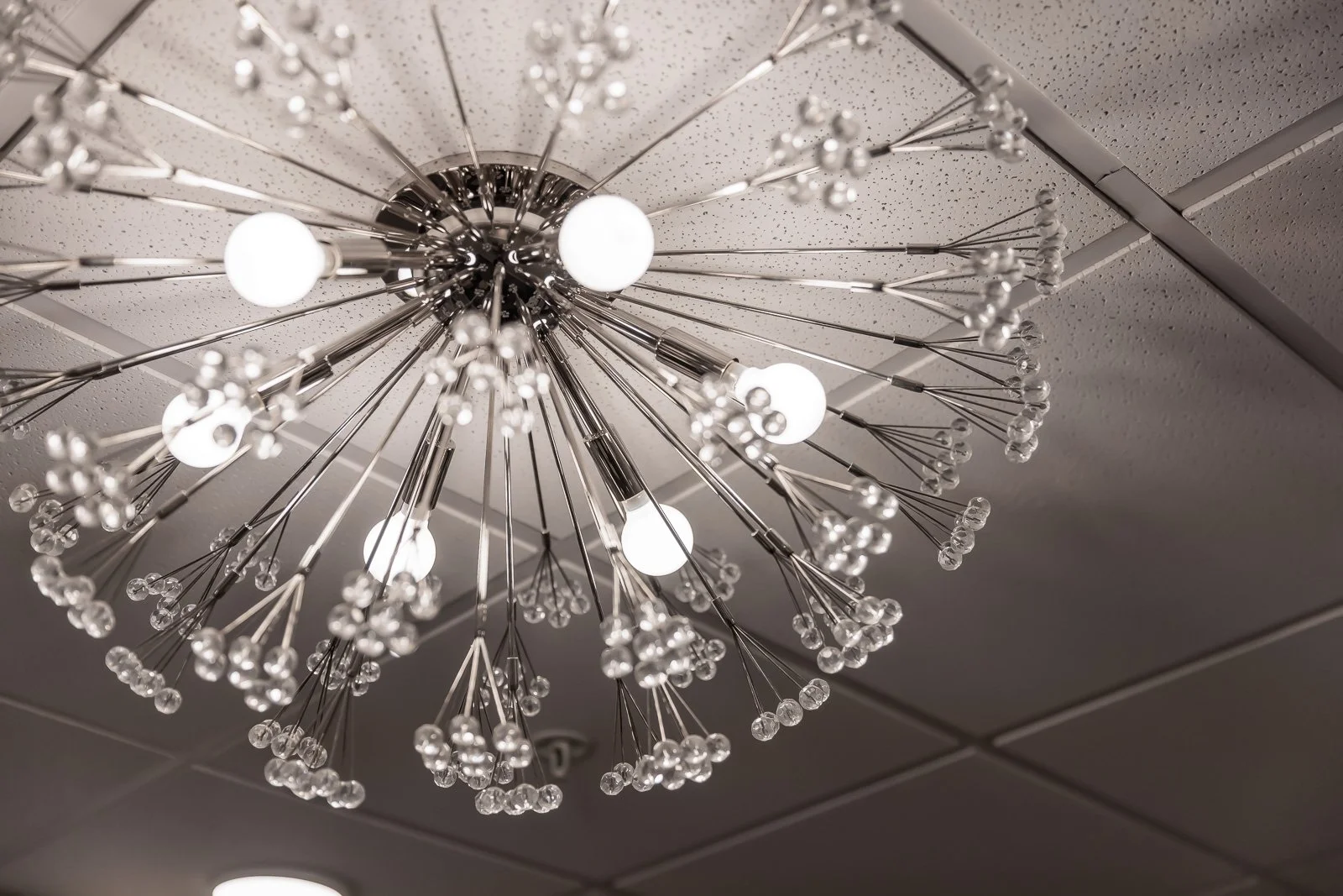
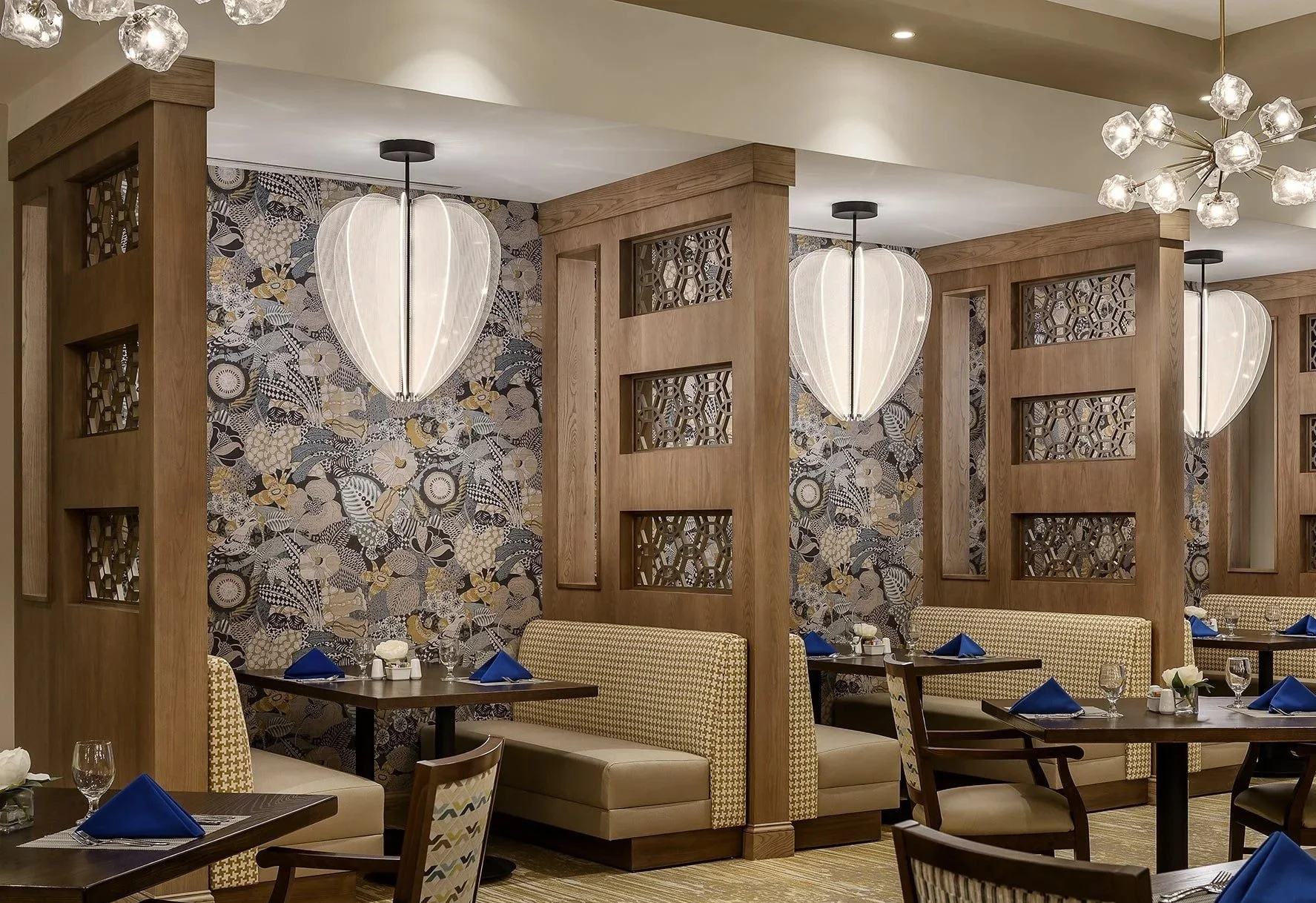
Lighting That Balances Function and Atmosphere
Lighting remains fundamental to safety and visibility, but it also plays a critical role in how a space feels. In 2026, we’re continuing to emphasize layered lighting strategies that support aging eyes while introducing fixtures that contribute sculptural interest and warmth. Thoughtful lighting enhances both comfort and connection.
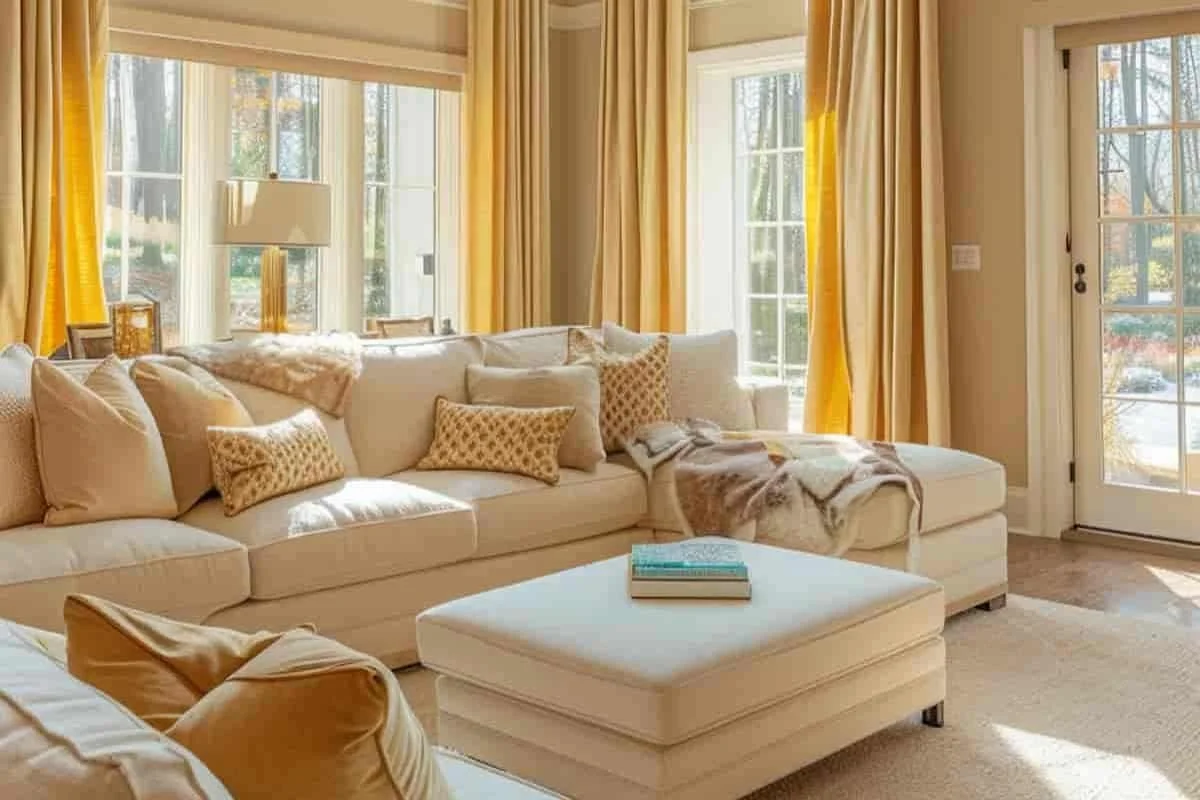
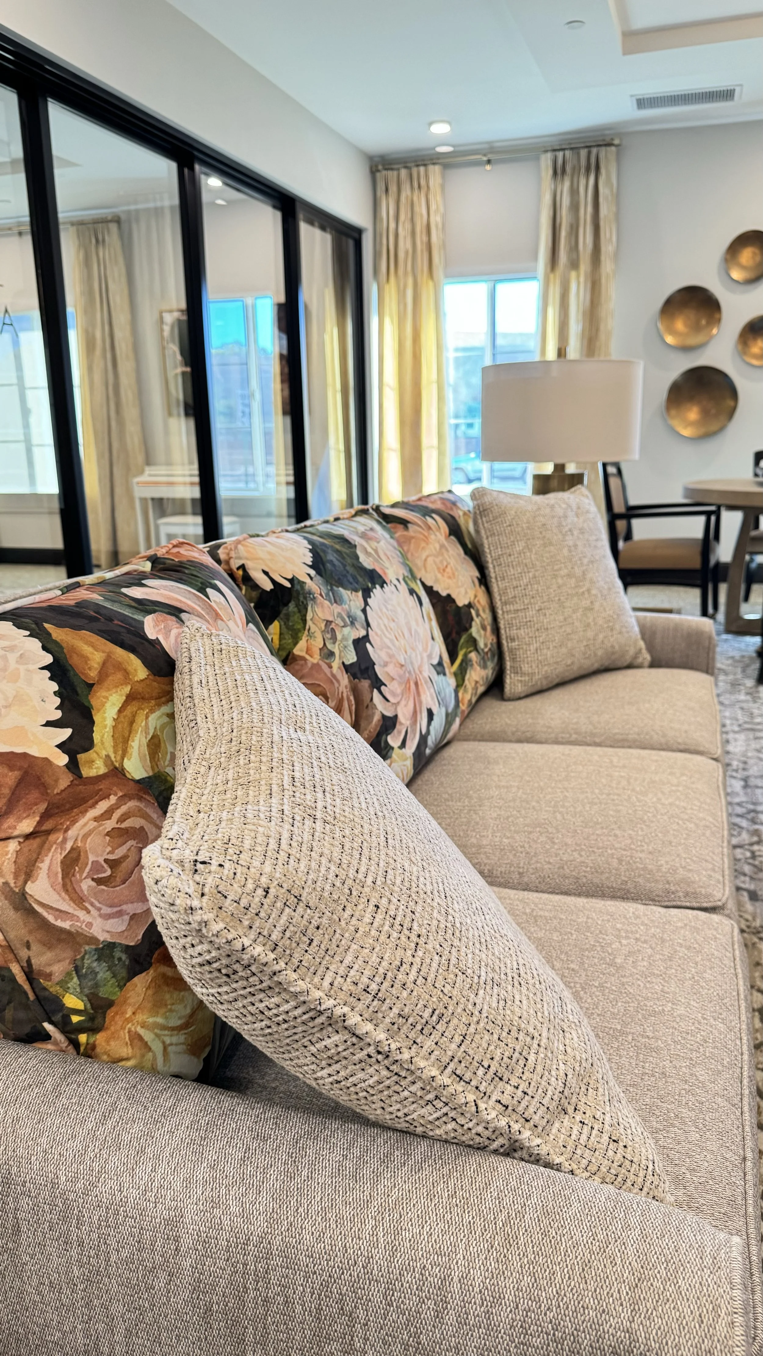
Textiles That Feel Residential, Not Contract
Advancements in performance fabrics allow for softer textures, more nuanced patterns, and richer palettes without sacrificing durability. These textiles bring comfort and visual interest, helping interiors feel lived-in rather than institutional.
Wallcoverings as Architectural Texture
Used thoughtfully, wallcoverings can act as a form of artwork—adding depth, texture, and storytelling to corridors and gathering spaces. Rather than decoration alone, they become part of the architectural experience as residents move through a community.
The Power of Thoughtful Detail
Small design decisions—contrast welts, tailored stitching, refined edges—are often the most impactful. These details are experienced daily and up close, contributing to a sense of quality, care, and intention. In senior living, they help spaces feel personal and considered.
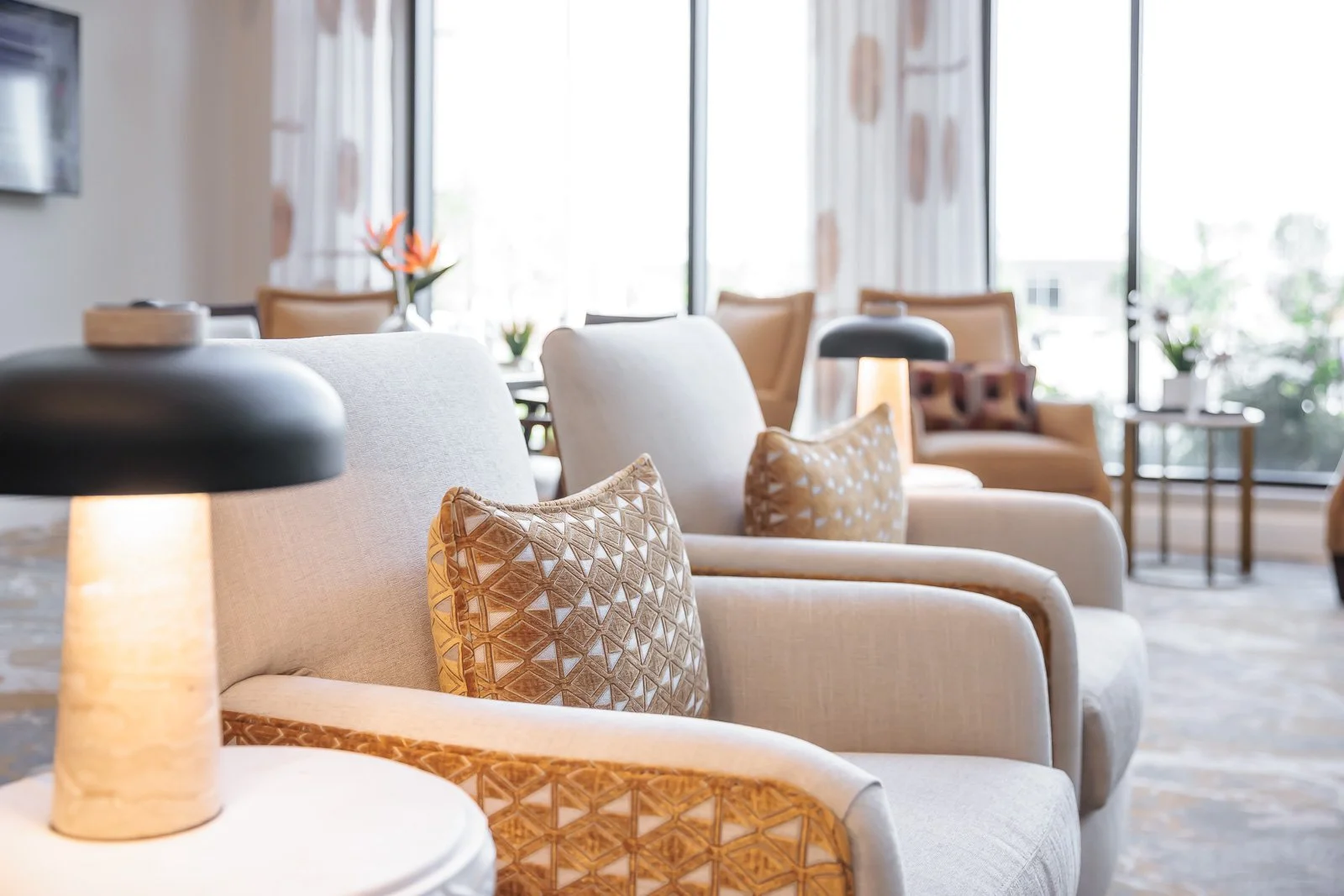
Accent Color, Used with Purpose
Accent color is reemerging as a strategic design tool. Applied intentionally, it helps define spaces, support wayfinding, and bring warmth to key areas. The focus is not on bold statements, but on meaningful moments of color that enhance how a space functions.
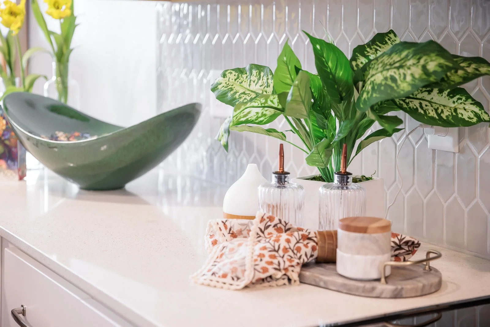
Accessories and Greenery with Intention
Rather than filling shelves for the sake of completeness, we’re curating accessories and plantings that add life, texture, and meaning. These elements help interiors feel inhabited and welcoming, reinforcing the sense of home.
Looking Ahead
As we move into 2026, our focus remains on design that prioritizes human experience over fleeting trends. Spaces that feel warm, layered, and personal. Residential rather than commercial. Thoughtful rather than generic.
And yes—fewer gray walls.
This is the direction we’re excited to continue leading as we design senior living communities that feel genuinely at home in the lives of the people who live there.